
RescuePawtal
- Ui
- Ux
- Copywriting
- Design System
- Front-End Build
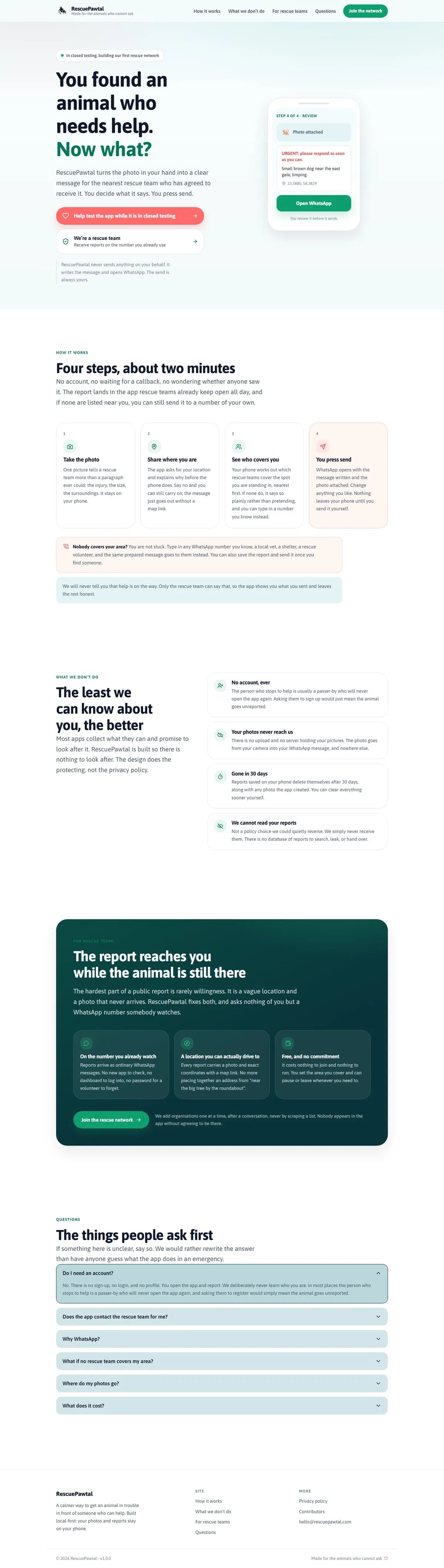
Somebody arriving here is usually standing next to an animal in trouble, so the page is built to be read in that state. It opens on the question they already have, answers it in four steps and about two minutes, and only then explains what the app is.
The middle of the page is given to privacy rather than features, because the objection worth answering early is what happens to a photo of a distressed animal and to the location it was taken at. Reports stay on the device, expire after thirty days, and no account is needed to send one.
The tone is deliberately plain throughout. The app is new and the rescue directory is still small, and the site says so rather than implying a network that is not there yet. The product case study covers the app itself, including why the iOS and Android flows differ.
Visit Site